As part of my Master’s degree I was tasked with reviewing the information architecture (IA) of a library website. We were given an option of three websites that, at the time, had generally poor IA and I chose to analyze Maplewood Library.
Maplewood Library has tons of offerings for the community and it has two campuses, so it makes sense that they have a lot of information to display on their site, but unfortunately for them, they just had too much information and it wasn’t easy to filter through. After completing a content inventory, they had over 200 webpages in their site map and it was evident to me that they were in desperate need of a redesign and restructure of their website.
**Note: since this case study, Maplewood Library has completed a redesign of their website, so many of the issues addressed in this case study have been resolved.
User Research
To best determine what people want/expect out of a library website, I conducted a survey via Survey Monkey distributed over Facebook that asked participants various questions about their experience with the library site they are most familiar with. This survey reached 88 respondents from every demographic age 18 to 65. This survey really helped bring in a focus onto what general library website users expect. A few key points were discovered based on this survey:
- Users are split on whether visiting the library in person is more preferable to utilizing the library website based on their needs.
- Users expect a library website to have an easy to use navigation, a strong library catalog with access to multiple libraries, online accounts to check due dates/fines/holds/etc., easy contact info and a clean design.
- Event calendars with events for all ages was a feature that many respondents voiced as a feature they really liked about their library.
- A majority of users (82.19%) access their library website from their desktop or laptop, but about 4 out of 10 users use their mobile device as well.
In addition to the survey, 2 librarians were interviewed in regards to library user behaviours. While they echoed many of the above sentiments, there was more of a tone that libraries themselves have to be better at adapting to more technological options like. Things like eBooks and various digital materials are in higher demand because people like the idea of getting their books without having to leave their house. When asked about the demographic of people that come into the library they found that the top groups they saw were the elderly (as they had the most free-time), parents with kids (as kids generally want to have a variety of books to read/be read), and teens/young adults (for homework, papers, group projects, etc.).
Finally, digging into some books about library website usage, we found that many users do not generally start their research on a library website citing that they generally found it easier to visit the physical library to research or that they already had materials in mind to check out. Additionally, users felt that library websites were too focused on the library organization itself and lack focus on the user and their needs. Luckily, with this redesign, the user is in the forefront of the changes that are being recommended in order to improve their experience with the Maplewood’s website.
Deliverables
User Personas
Based on the research I was able to create three personas based on the typical library users. Of the three, the primary persona is the general library user who represents a majority of library users and should be considered first for any user experience questions.
The secondary personas are groups that are important to the library as well and need to be considered.

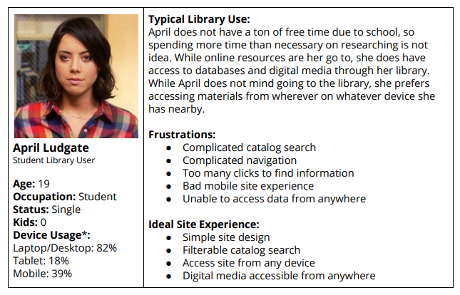

*Note: Device usage is based on the percentage of users from the survey who indicated they utilize that device to access their library’s website. Totals will not add up to 100% as this was a multiple choice question. Data indicates what percentages of users who answered that question chose that device.
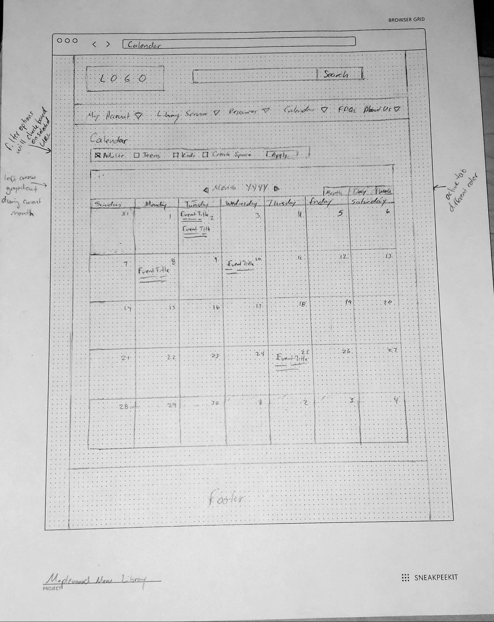
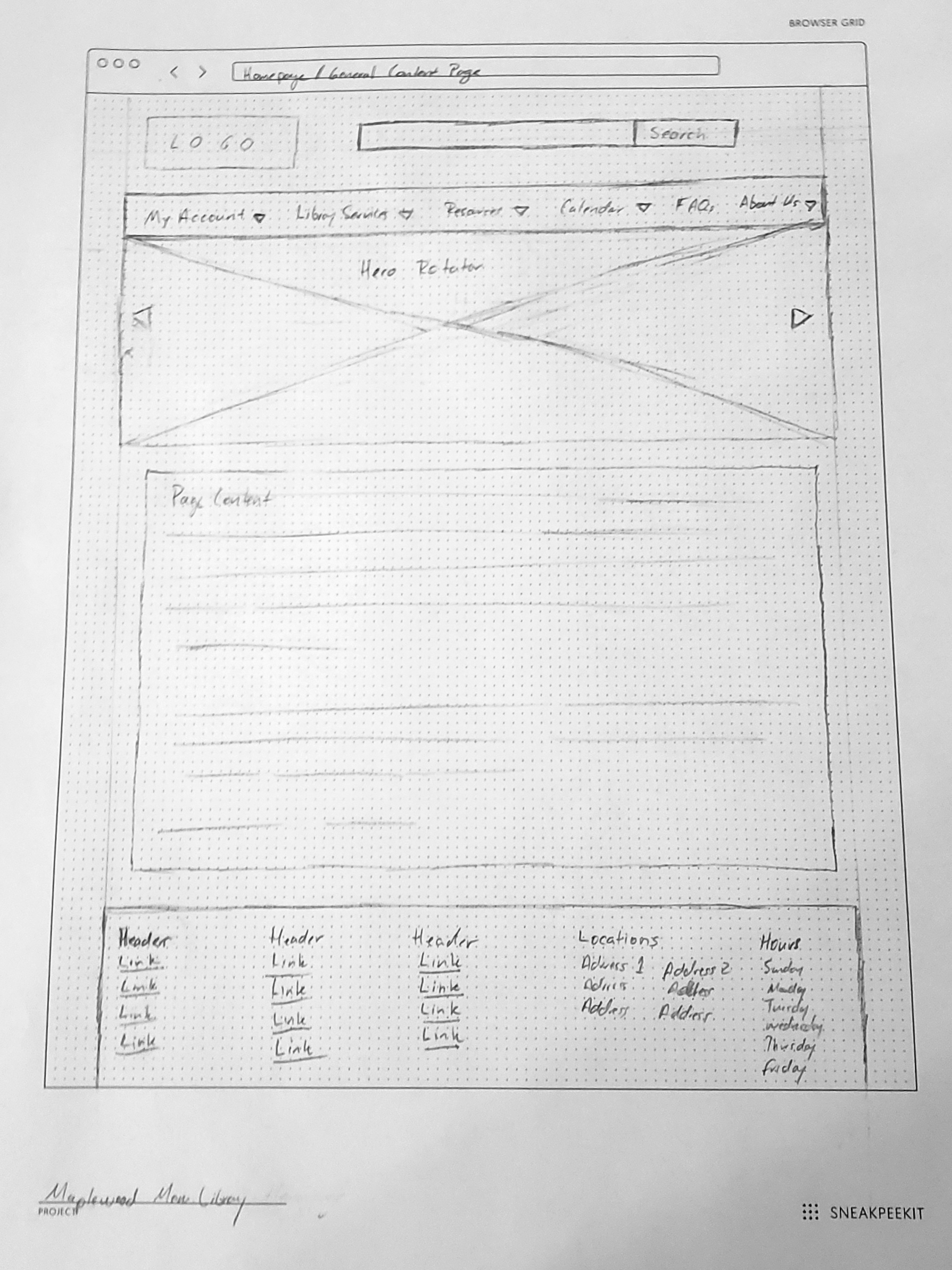
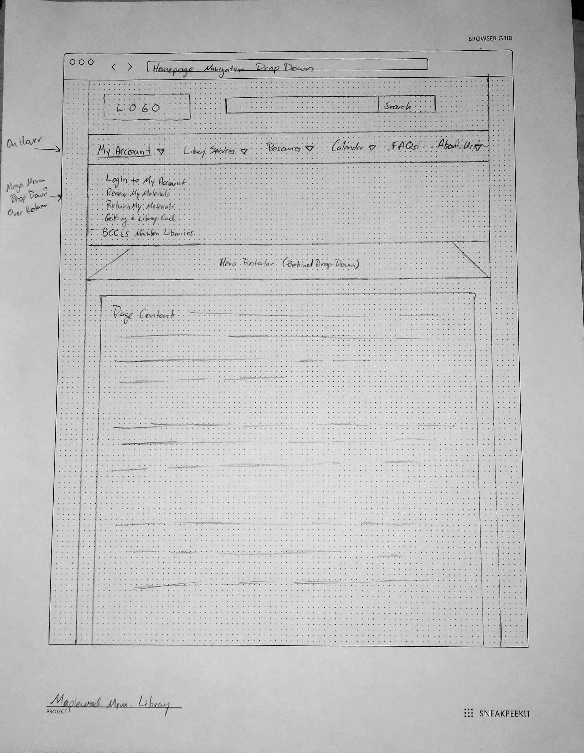
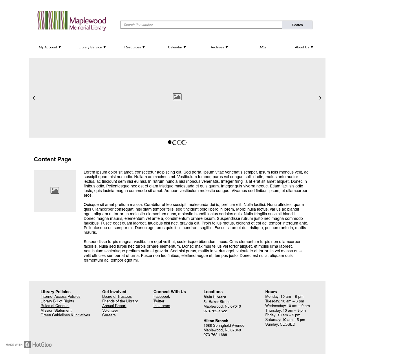
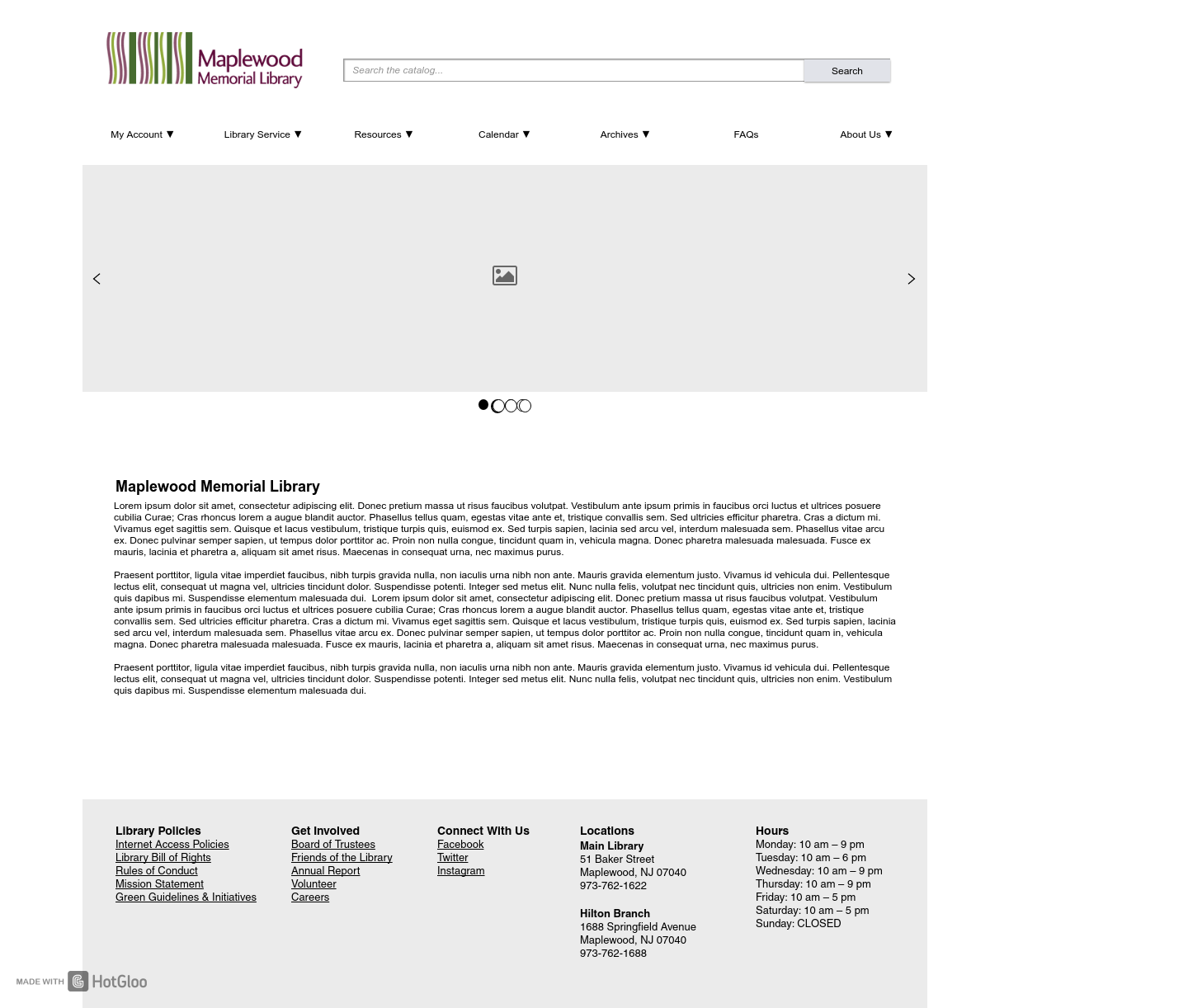
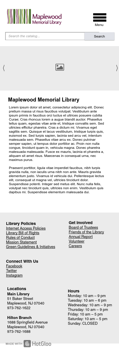
Site Map/Wireframes
Maplewood’s original site inventory had a lot of pages that were redundant or were not necessary to users based on the user survey. As a result, I took their existing pages and used the personas to trim down the site map from a couple hundred pages down to a more manageable amount of pages and created a new site map.
Once the site map was created, I sketched out a loose wireframe for a few of the key page and then mocked up those into high fidelity wireframes. Overall, I feel the wireframes really showed an improvement in the site because it consolidated so much information into categories that were unique and made sense and that all information could be found within a few clicks, which is always important to users.


Methodology
I started very simply by clicking through the IKEA site and determining roughly how they expect you to navigate through the site, find different types of items and looking at how you would check out once you’ve selected the items you’re looking for. During this time, I found a couple that stood out as being usability issues, but I wanted to do a bit of testing to see if I was being overly-critical of the site.
