One of my first independent case studies was looking at IKEA. I was looking at the user journey of how someone would go from IKEA’s homepage through the search process and ultimately how they would end up checking out. My goals were to see what sorts of usability issues or tripping points I could discover along the way and ultimately come up with recommendations as to how to resolve these issues.
Research Questions
- How does a typical user use the IKEA website to research furnishings?
- What factors matter most to the typical user when selecting a furnishing?
- How does the typical user purchase furnishings from IKEA (online vs. in-person)?
- For those who do order online, what factors help/impede them from completing a check-out?
- What factors determine whether a typical user chooses to get furnishings delivered vs. personally picking the items up?
Methodology
I started very simply by clicking through the IKEA site and determining roughly how they expect you to navigate through the site, find different types of items and looking at how you would check out once you’ve selected the items you’re looking for. During this time, I found a couple that stood out as being usability issues, but I wanted to do a bit of testing to see if I was being overly-critical of the site.
I created a quick user study with a list of tasks to complete:
- Search for a 3-seat couch
- Search for a brown leather armchair
- Find a bookcase that fits in a 3-foot wide space
- Add more than a single item to the cart at a time
- Remove an item from the cart
- Get to the checkout screen
- Find their nearest location
I conducted this research with 4 participants and these 5 key issues were uncovered:
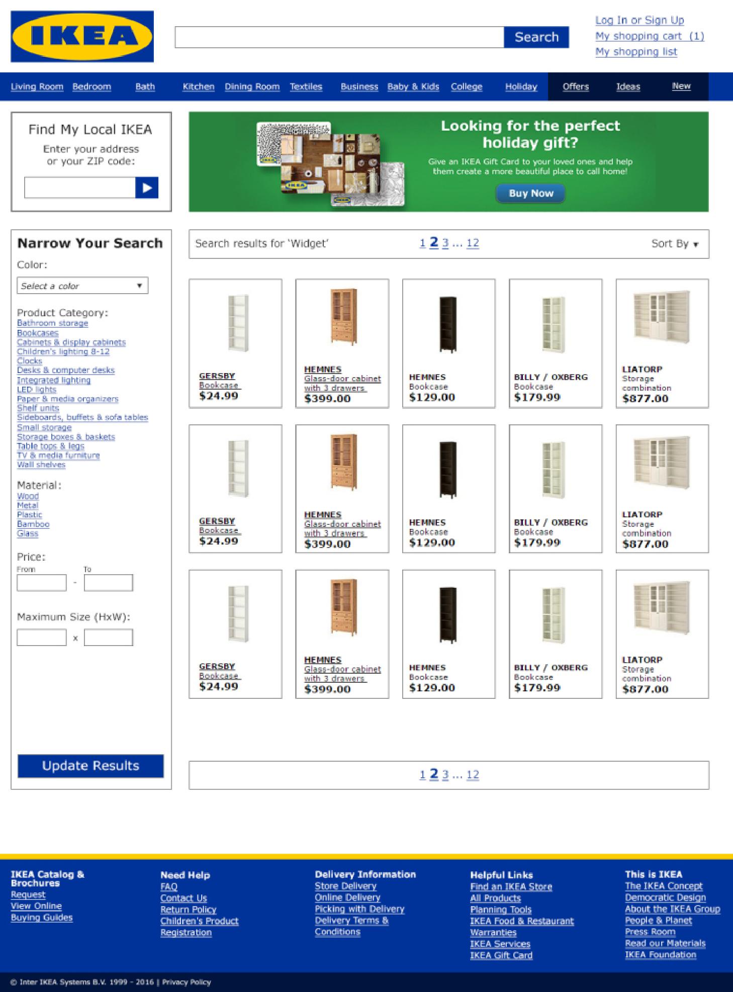
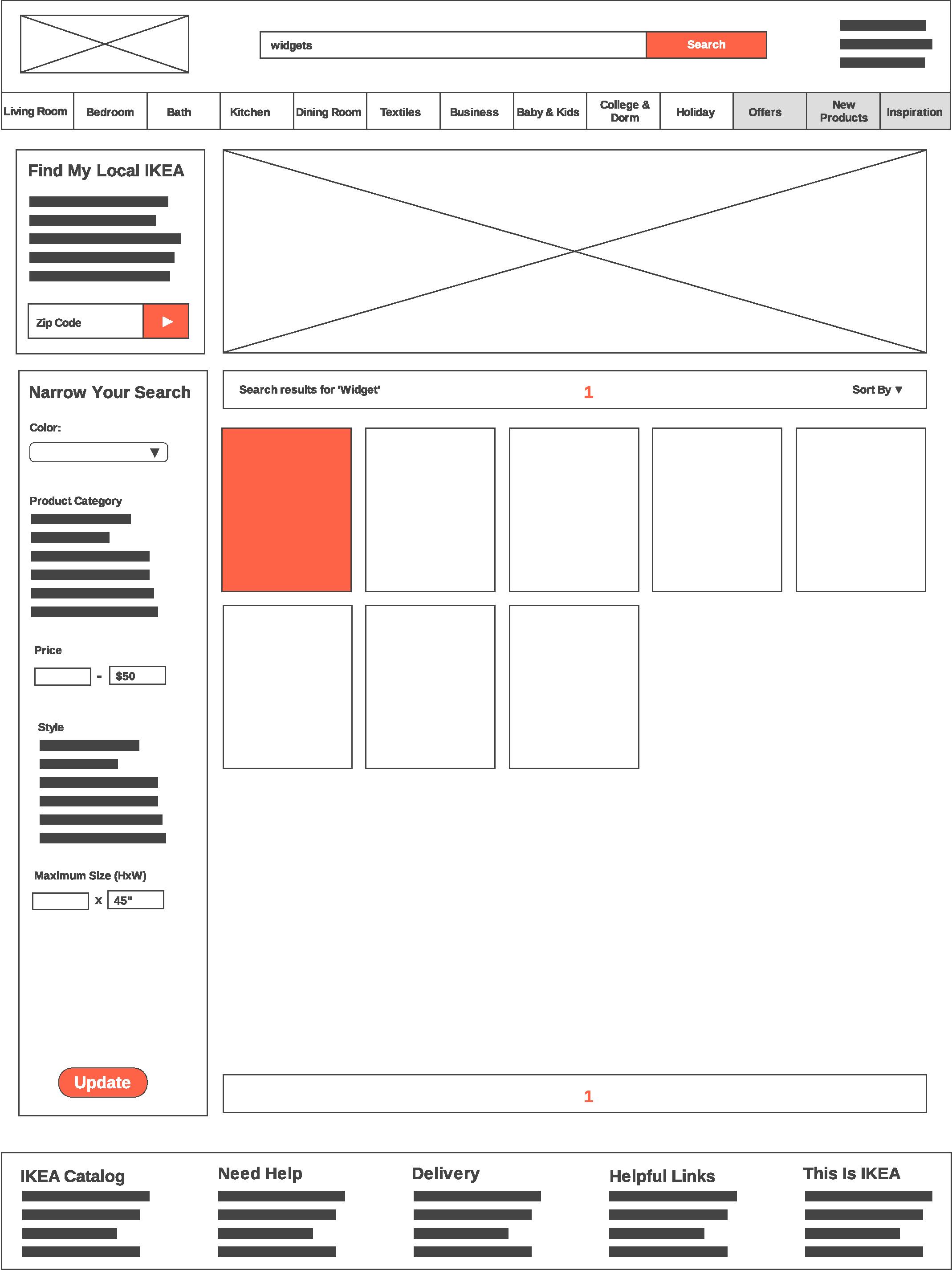
- The homepage was mentioned as being a bit messy and that it could improve by being a bit more organized. Additionally, the navigation was questioned because they have almost all their products under one mega menu that requires extra clicks to hope you find what you’re looking for (Ex: Can I find a pantry in Kitchens? Secondary Storage? Small Storage? All of those?)
- The search and search results were also mentioned as being difficult to use because it is not a smart search that correlates similar words togethers (ex: sofa, couch, chaise, love seat, lounger) so you have to use their specific category name to search. Once arriving in the search, the filters were mentioned as not being the most user-friendly and needed to be available regardless if you arrived from search or from clicking through the nav.
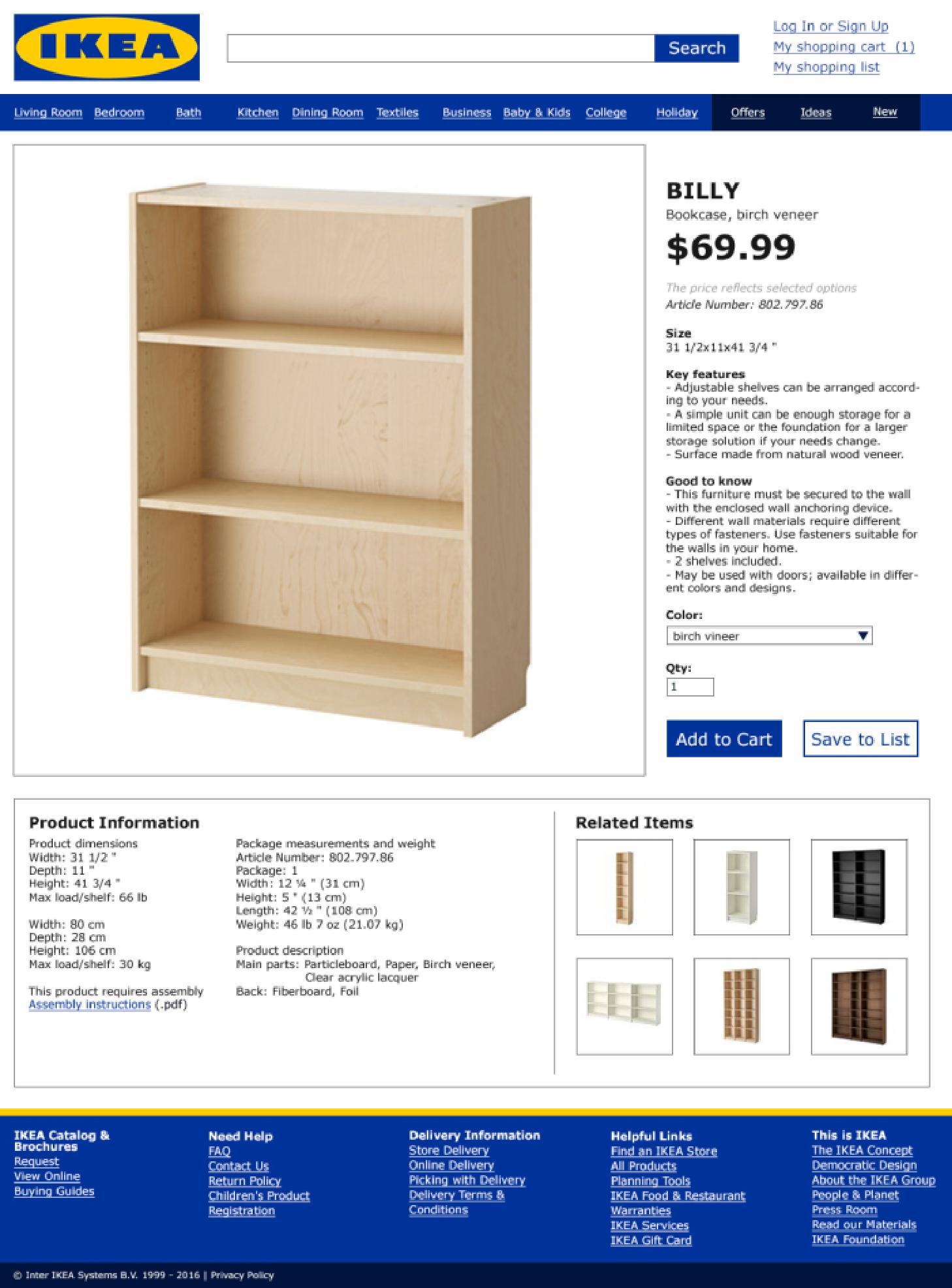
- On the product screen one thing that was mentioned that it would be nice to convert from metric to imperial (or have that active by default on the US site). Additionally, call to action buttons on the site could be improved to better indicate actions.
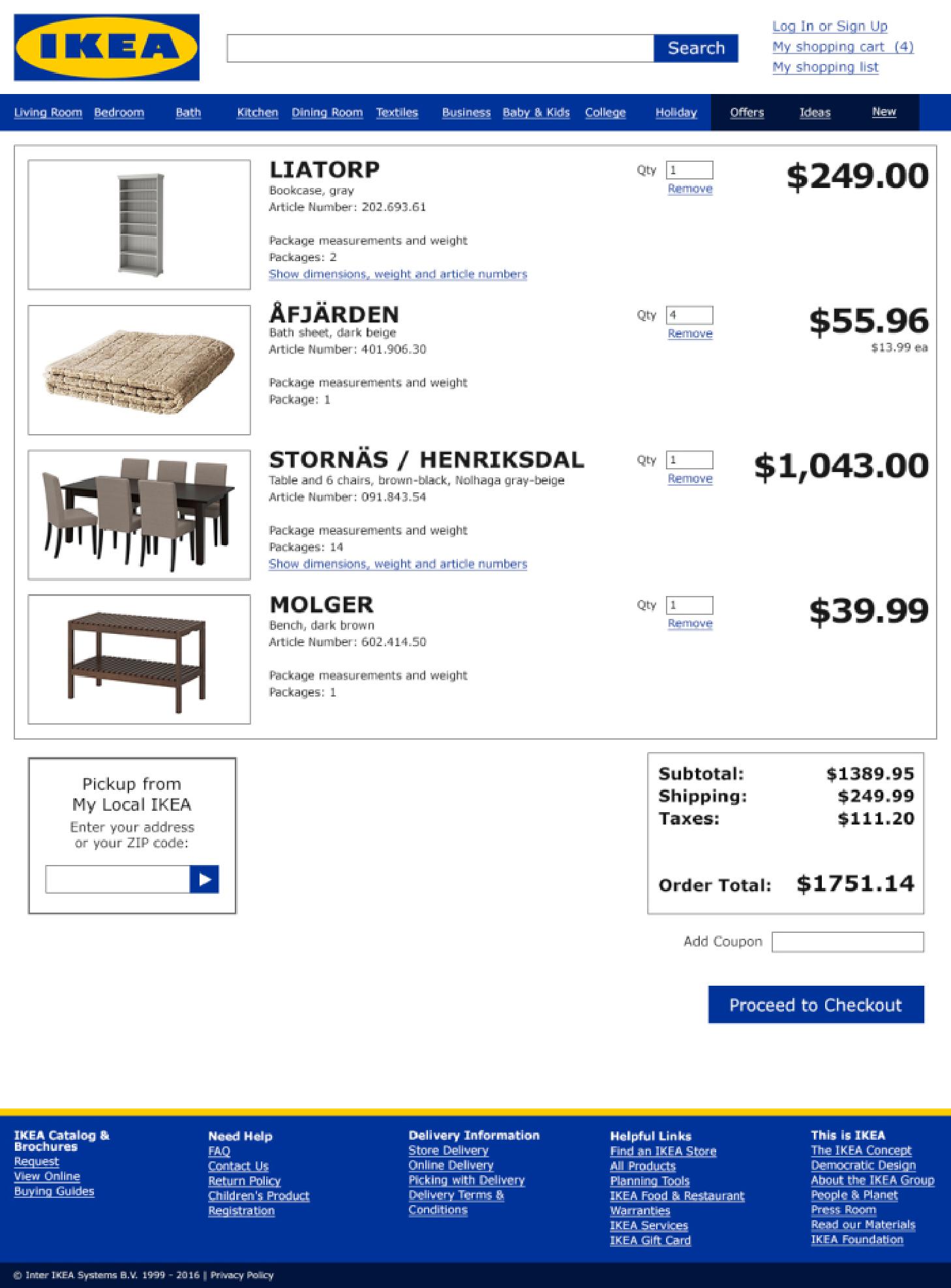
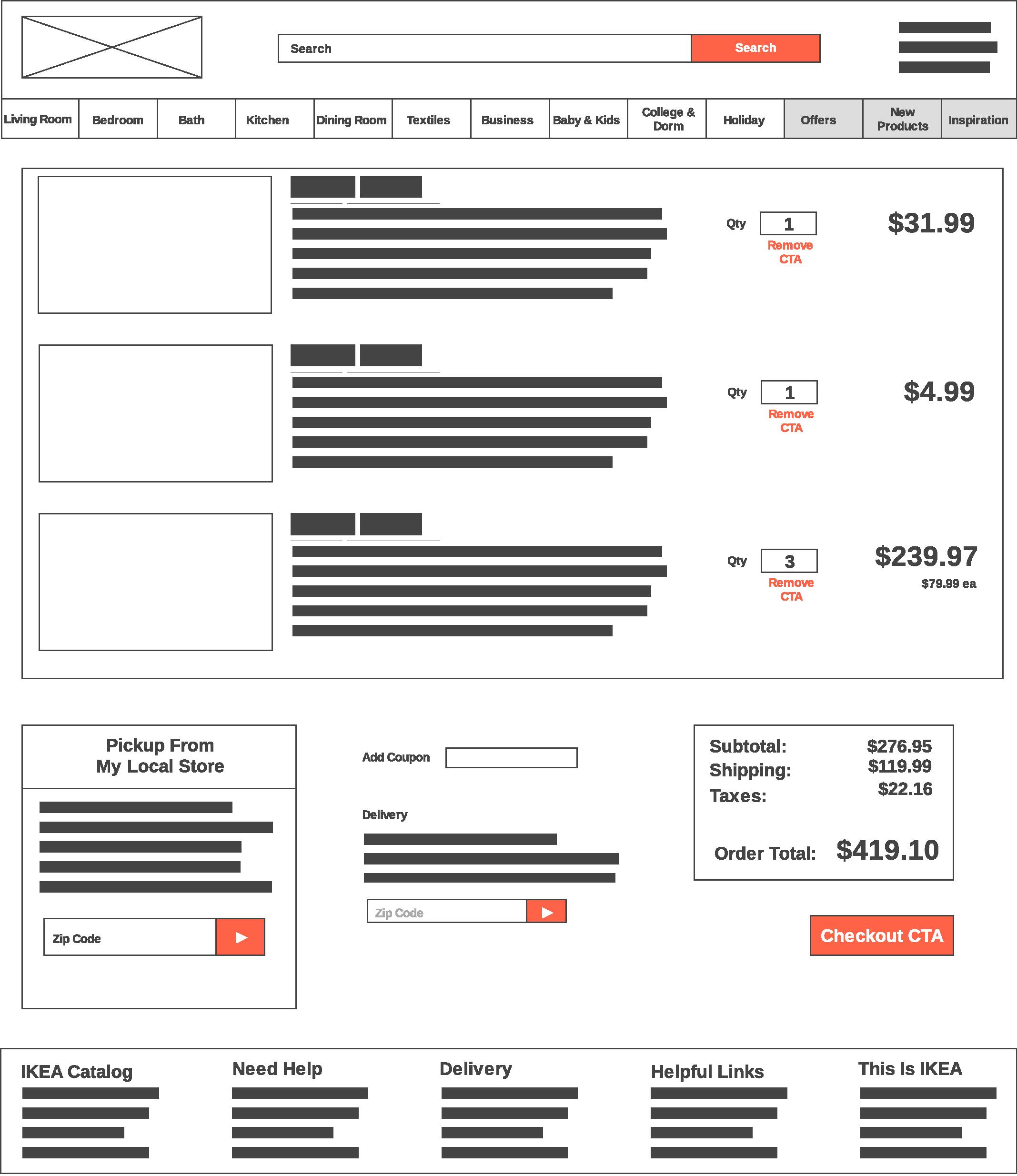
- In the cart, it is not intuitive how to remove items from your cart if you no longer want to purchase an item in your cart.
- While the checkout process was generally seen as simple, the order of the address fields caused all participants to stop or go back to fill out information because it was organized in an unexpected manor (Address > State > City instead of expected Address > City > State). Otherwise there were a couple labeling issues that were brought up on the forms, but nothing that was interruptive to the checkout process.
Deliverables
Wireframes
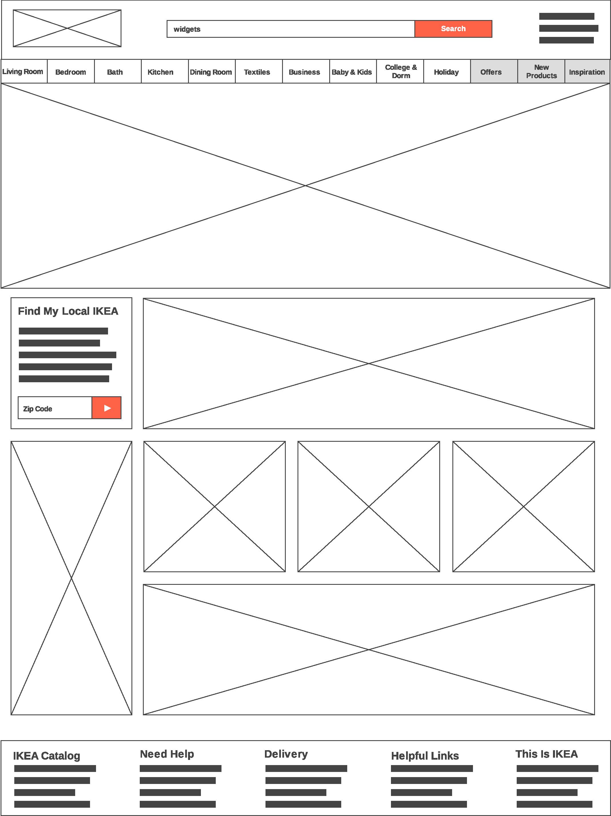
Based on the research of the user journey, I created some wireframes for the pages throughout the user journey that would hopefully help with some of the user issues brought up with the user studies. I will admit that they are a bit too high-fidelity for typical wireframes, but I wanted to add some basic details to help make the wireframes make a bit more sense on their own.
Each of the images have a description to help explain recommended changes from the current IKEA website.


Mock-Ups
Based on the wireframes, I made some high-fidelity mock-ups with my recommendations included. I feel that with these changes, the flow of the journey from arriving at the IKEA website to finding your items, adding them to your cart and then checking out (including making the decision for pick-up or delivery) is much simpler.